CHIP / BurdaForward · 2020 · Live product

Dealfinder
A responsive redesign within the CHIP style guide
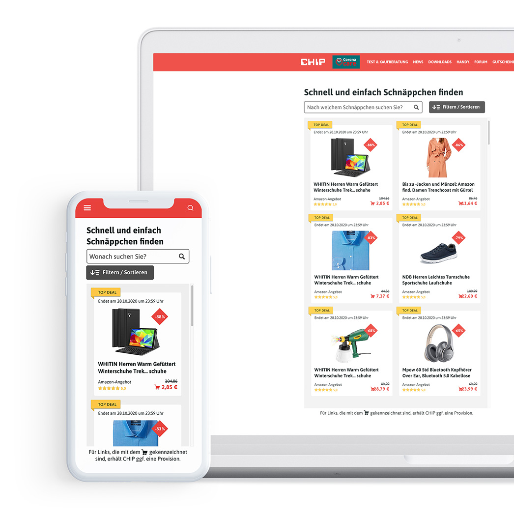
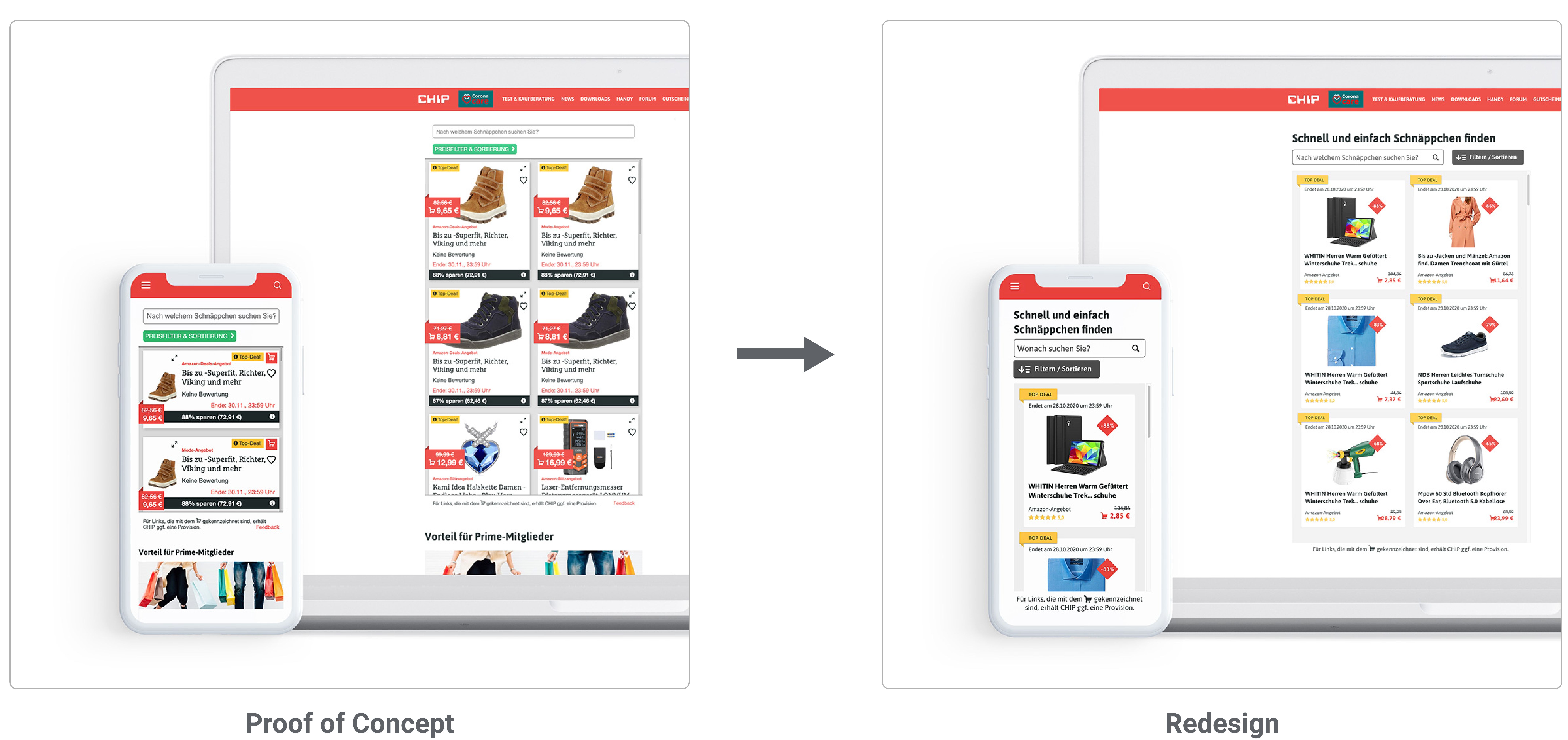
The Dealfinder was popular, but its design felt outdated. In one month I ran stakeholder interviews and a prioritization workshop, redesigned the product tiles and the sort and filter options, A/B tested four tiles on the live site, and handed over a responsive design that went live on the CHIP website.
OVERVIEW
My role
Interface Design
Team
UX designer
Product Owner
Frontend Developer
Duration
1 month, 2020
Context
CHIP / BurdaForward · live product
Problem statement
CHIP is part of BurdaForward, whose brands reach more than 41 million people a month. Before I joined, CHIP’s test and buying advice team had built the Dealfinder as an MVP within one OKR cycle. It shows discounted offers from shops such as Amazon, Saturn and MediaMarkt inside articles, for example during Amazon’s Cyber Week. Earlier user research with the proof of concept showed that people used and clicked it often, but its design felt outdated and it was hard to use on phones. The concept had proven its value. Now it had to follow the CHIP style guide and become easier to use.
The project came with strong technical limits. The Dealfinder runs as an iFrame, so to work in the mobile AMP version of CHIP’s articles it could not be taller than 600 px.
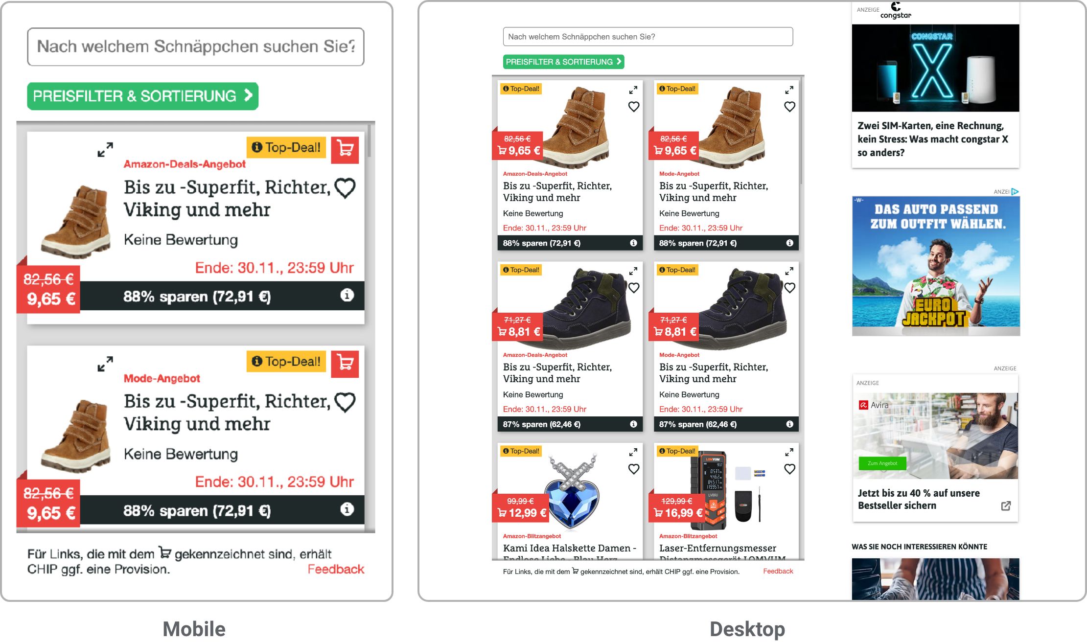
“What product am I being offered?” and “Is it a good offer?”
Approach
The goal was to turn the proof of concept into a modern, clear design that fits the CHIP brand. I started with a requirements analysis and a prioritization workshop with the main stakeholders. My own goal was to make the product tiles clearer without losing information people need, while keeping the effort for the developers low. Over three iterations I designed more than 30 tile variants within the style guide and the technical limits.
View final designIterative process
01
Requirements analysis
Stakeholder interviews
Prioritization workshop
02
Design
Product tiles
Filters and sorting functions
03
Handover
Design presentation
Handover for technical implementation
REQUIREMENTS ANALYSIS
Stakeholder interviews and prioritization workshop
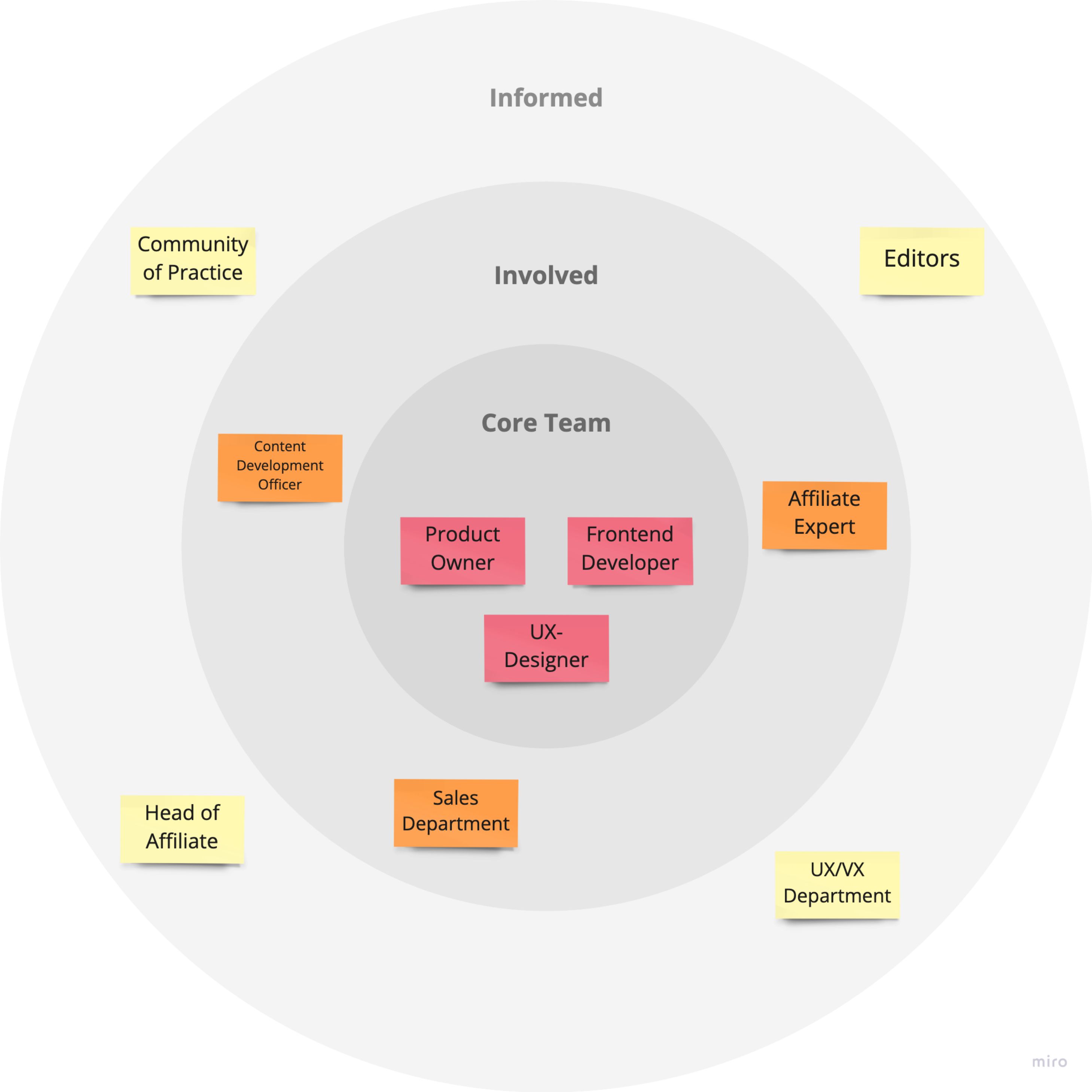
I started with a stakeholder map in Miro and then interviewed people from the “Core Team” and the “Involved” circle to collect the requirements for the redesign.
In a workshop, all stakeholders prioritized these requirements, above all the information each product tile should show. We sorted them into “mandatory” and “nice to have”.
Derived requirements
With the team I turned the proof of concept, the interviews and the workshop into requirements and ideas for the product tiles.
Mandatory
- Product name and picture
- Deal end / runtime
- Price (new and old), incl. shopping cart icon
- Discount (in % or €)
- Vendor
- Sort function (discount, price, vendor)
- Filter function (price range, vendor)
- AMP support (max. 600 px tall)
- Usable on the phone, tablet and desktop
Nice to have
- Labeling: top deal / highlight deal / ad (+ info icon)
- Rating
- Image enlargement (idea: magnifying glass at the top right of the image)
- Heart icon for “Saved Deals” (only saved within the session)
- Category filter
- Search field
DESIGN
Conceptualization and design of the product tiles
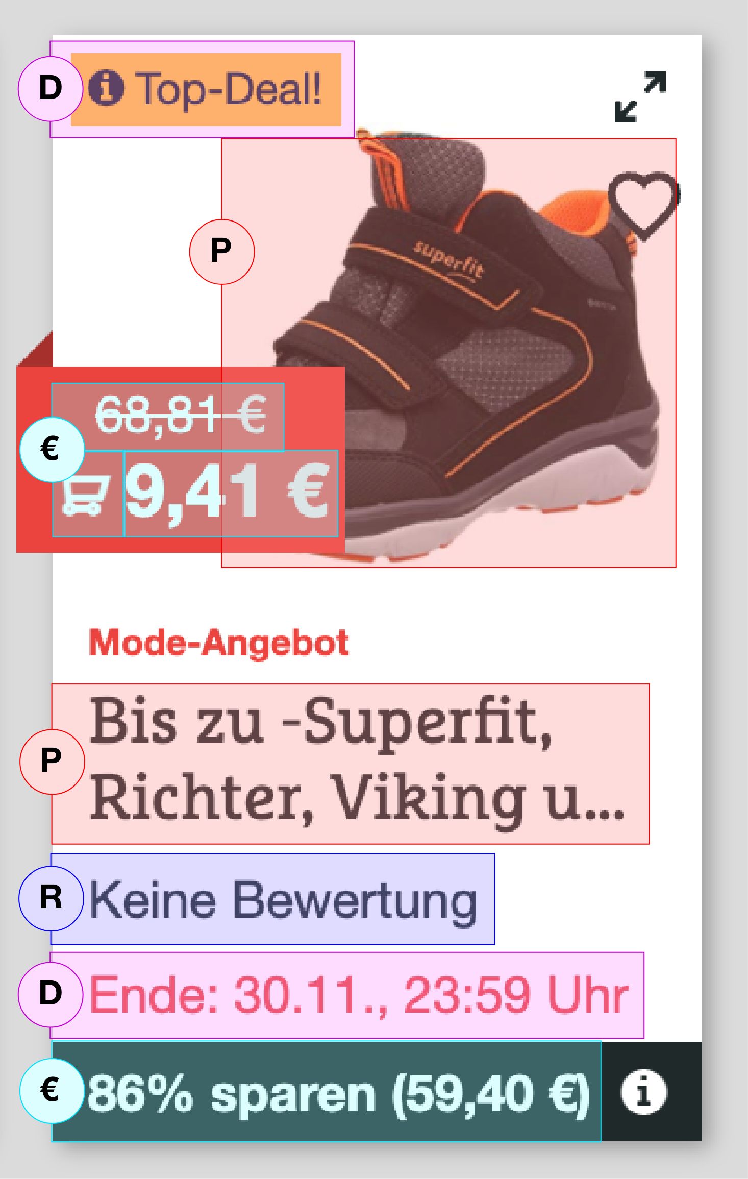
I first looked at how the tile could be divided into meaningful groups and defined four clusters: deal (type of deal, duration), product (image, name), rating (provider, stars) and price (deal price, affiliate marker, strike price).
In the old tile, information that belongs together, such as the price or the deal details, was spread across the tile.
So I redesigned the tile around these clusters to group related information and reduce the cognitive load for people scanning it.
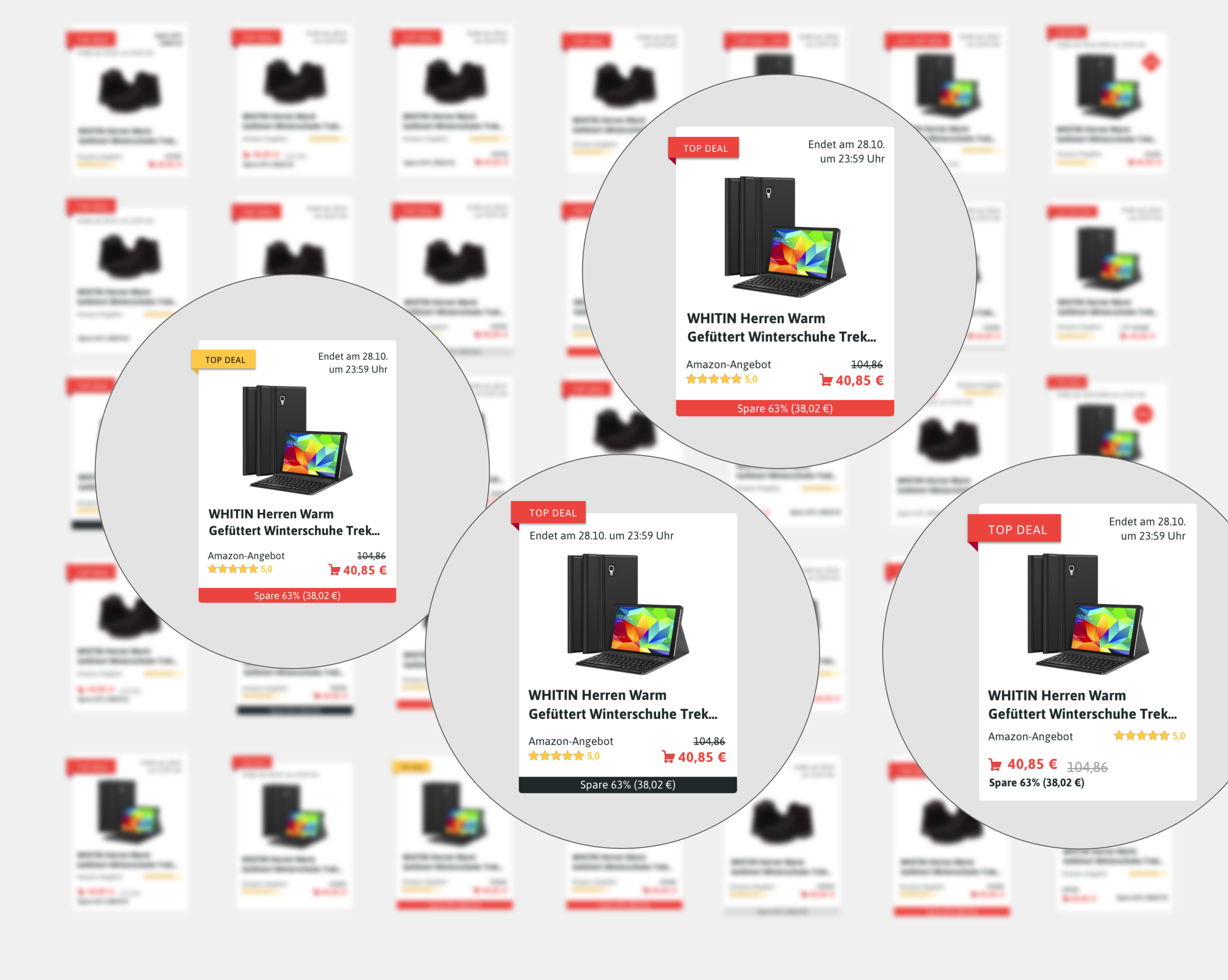
Selection of several variants of the product tile
In three iterations I designed over 30 variants of the product tile in Sketch, each with a different focus. I built them from components of CHIP’s design system to work faster and stay on brand.
With the product owner and the frontend developer, I narrowed them down to four tiles based on technical feasibility, user experience and business goals.
We then A/B tested the four tiles on the live website with Optimizely and compared click and conversion rates. The winner became the final product tile.
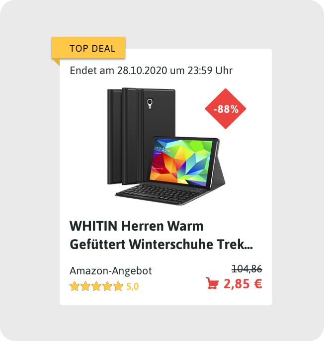
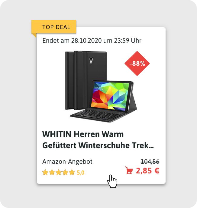
Final product tile
The tile that won the A/B test groups what belongs together. The eye goes to the product image and the discount first, so the two questions “What product am I being offered?” and “Is it a good offer?” are answered at a glance. Details such as the price or the rating on the shop’s website come after that.
Design of filters and sorting functions
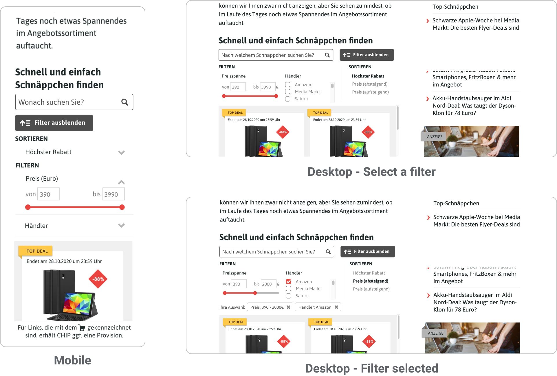
With the tile settled, I moved on to sorting and filtering. People can filter by price range and shop, and sort by discount or by price (ascending or descending). The options had to be easy to reach, show clearly that a filter is changing the list, stay within the 600 px limit on phones and work responsively across different article templates.
IMPLEMENTED DESIGN
HANDOVER
Implementation concept and handover
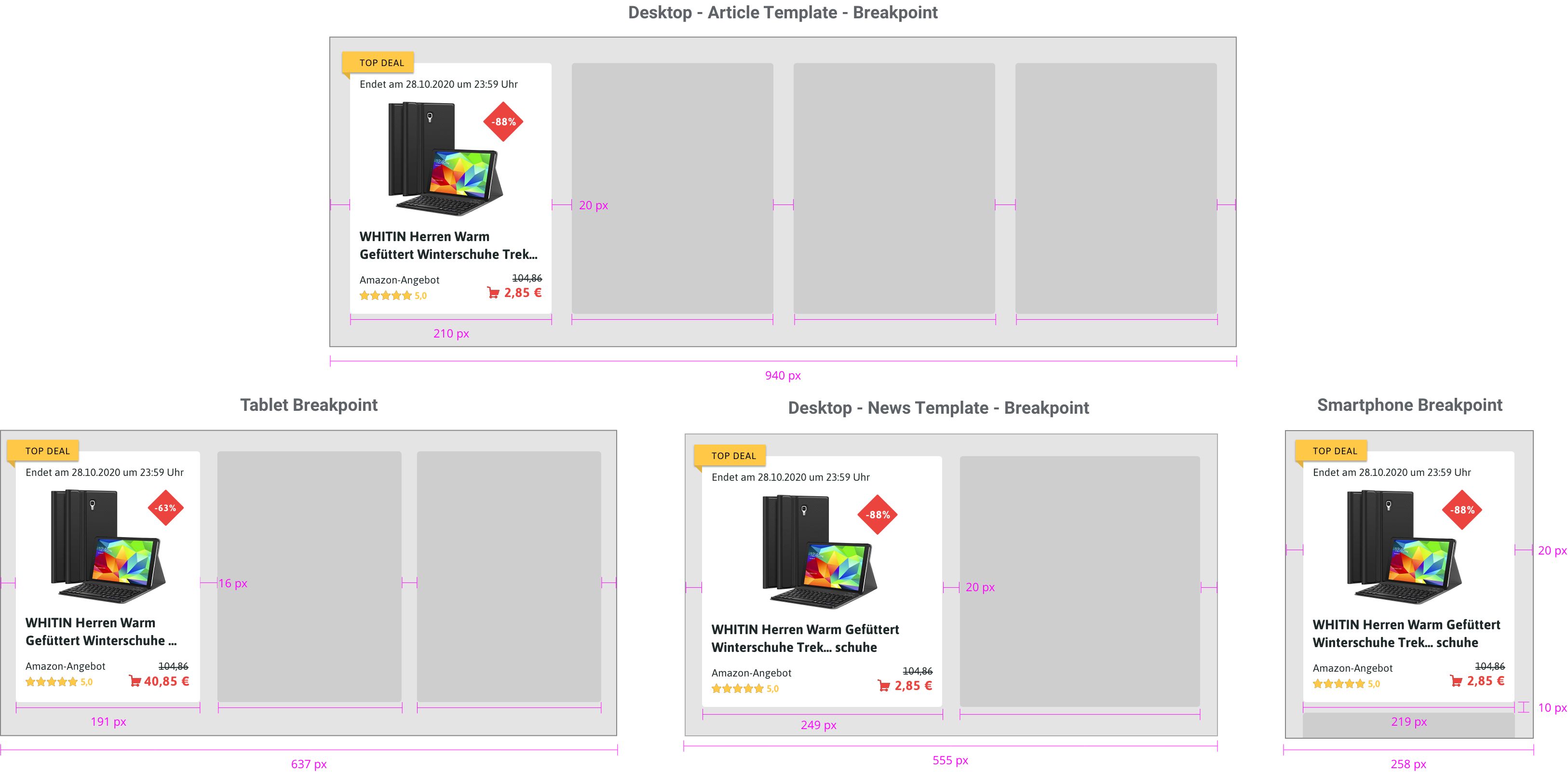
As a basis for talking with the product owner and the frontend developer, I wrote a technical implementation concept that defines the responsive behavior of the Dealfinder with CSS Grid. I defined breakpoints for the different devices and page layouts, the minimum and maximum width of the tiles and the number of columns. The developer built the Dealfinder from this concept, which kept the look and feel consistent across devices.
For the handover I used Zeplin, with notes and comments directly on the designs. In weekly check-ins with the developers I kept supporting the implementation from the design side.
CONCLUSION
Outcome
The redesign went live on the CHIP website within one month. The tile that won the A/B test on the live site became the final design.
It was a project I really enjoyed, with a good mix of working on my own and with the team. After all the iterations, seeing my design live on CHIP and in front of so many readers was a special moment.
“Lukas showed a lot of commitment and a good intuition and contributed very quickly with good ideas. His open way of communicating, inquisitiveness to question things and his passion to identify and solve user problems are excellent characteristics of a user experience specialist in the making.”
 Annette Hutt, Team Lead User Experience & Visual Design, CHIP Digital
“Lukas is an empathic designer with an innate curiosity for user needs. Lukas' skills in visual design combined with a strong foundation in UX research, reframing customer problems, and developing and prototyping delightful concepts makes him an asset on the team.”
 Sylvia Böhm, Senior Researcher & UX Manager, BurdaForward
Learnings
Brand and responsive at once. Designing for desktop and mobile within a brand style guide.Balance three sides. Technical constraints, stakeholder requirements and user needs all shape the result.Build with components. A design system keeps a fast redesign consistent.
CHIP is a trademark of CHIP Digital GmbH, and BurdaForward is a trademark of BurdaForward GmbH. Product names, images and shop names in the screenshots belong to their owners and are shown for illustration only. This is a personal portfolio account, not endorsed by CHIP Digital or BurdaForward.